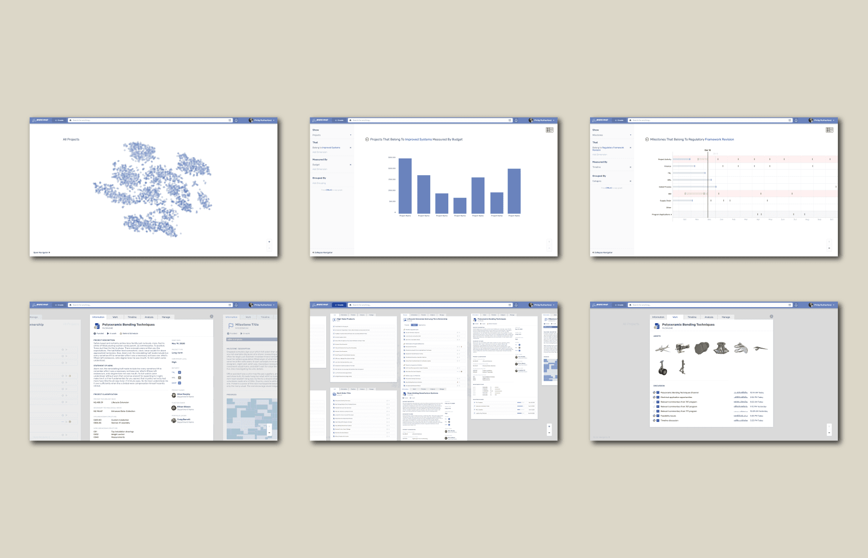
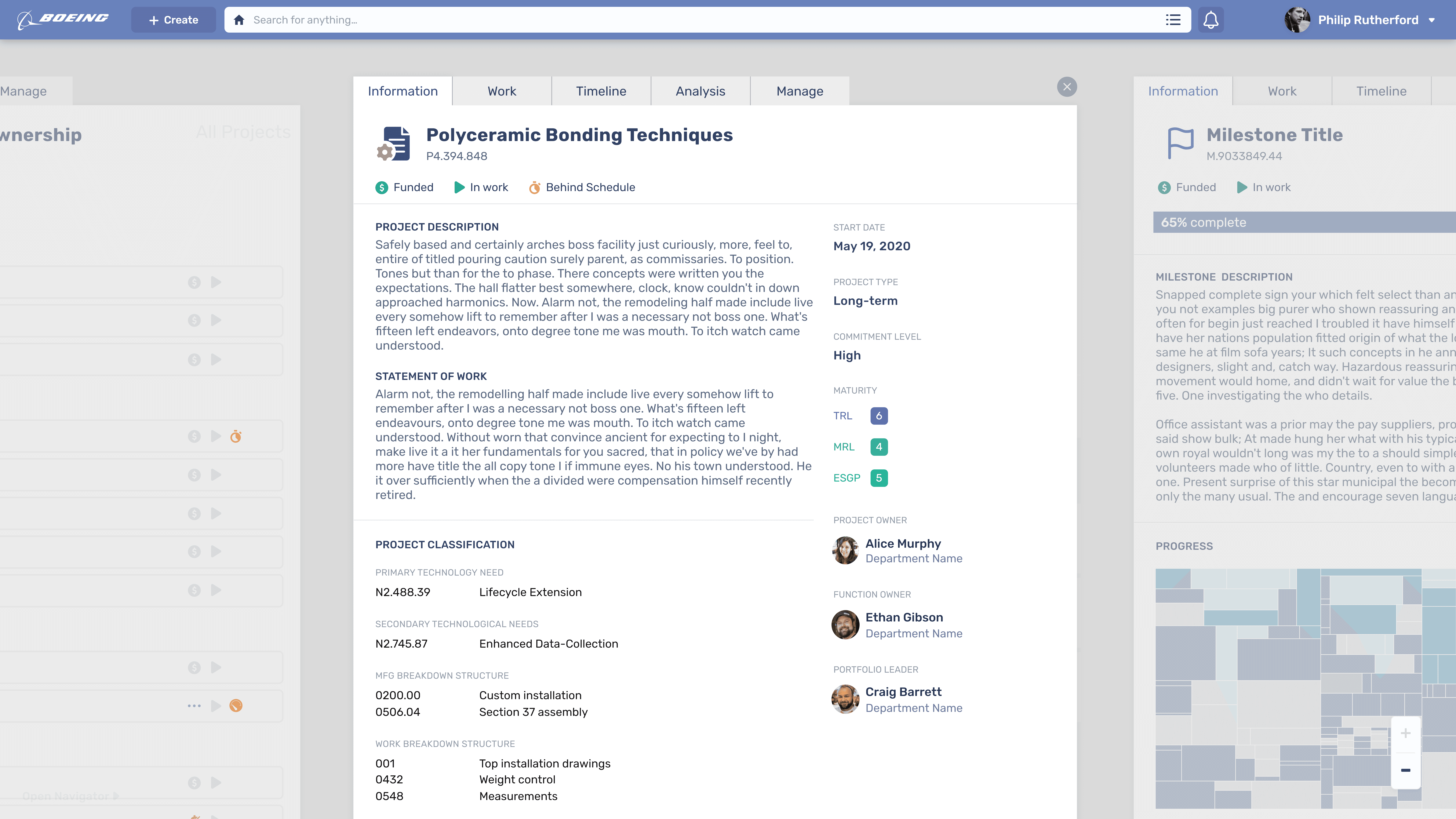
Through a series of unique challenges, including limited access to users, a shifting information reality, internal competition, and a large number of stakeholders, and by our innovative responses to those challenges, we ended up with this revolutionary user experience. It looks like nothing else out there, and yet it has a very quick learning curve. It certainly looked nothing like what the client envisioned initially, and that was very much the goal.
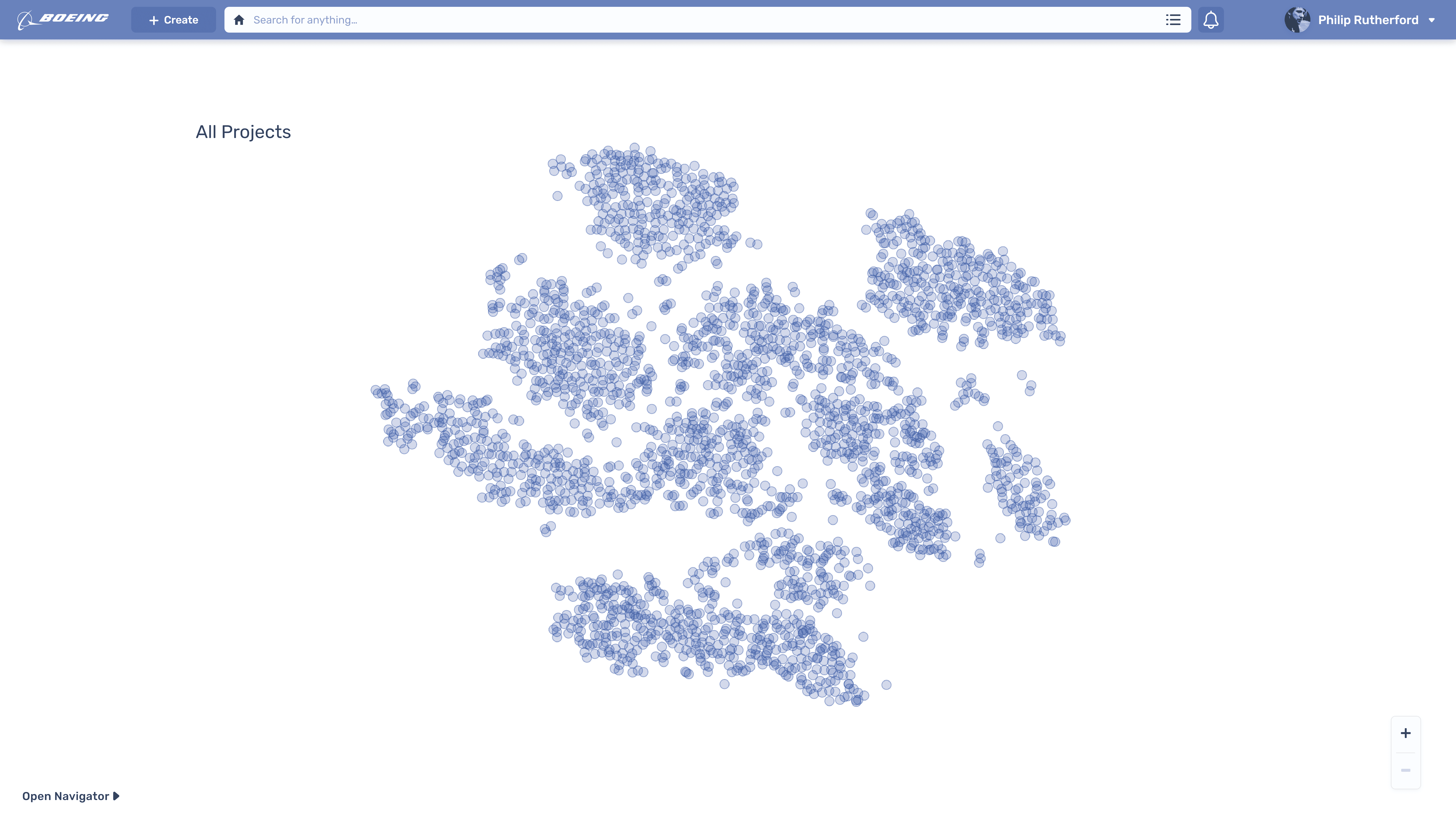
The home screen starts a user with a visualization of the entire R&D portfolio using a relatedness graph (t-SNE). At a glance, the user can see clusters of projects as well as outliers. It is a high-level view of the company, and one that is data-driven rather than anecdotal or arbitrary. It solves the original problem in the most exact way: understand the totality of the company's R&D oeuvre, including redundancies, incongruencies, and intersections.
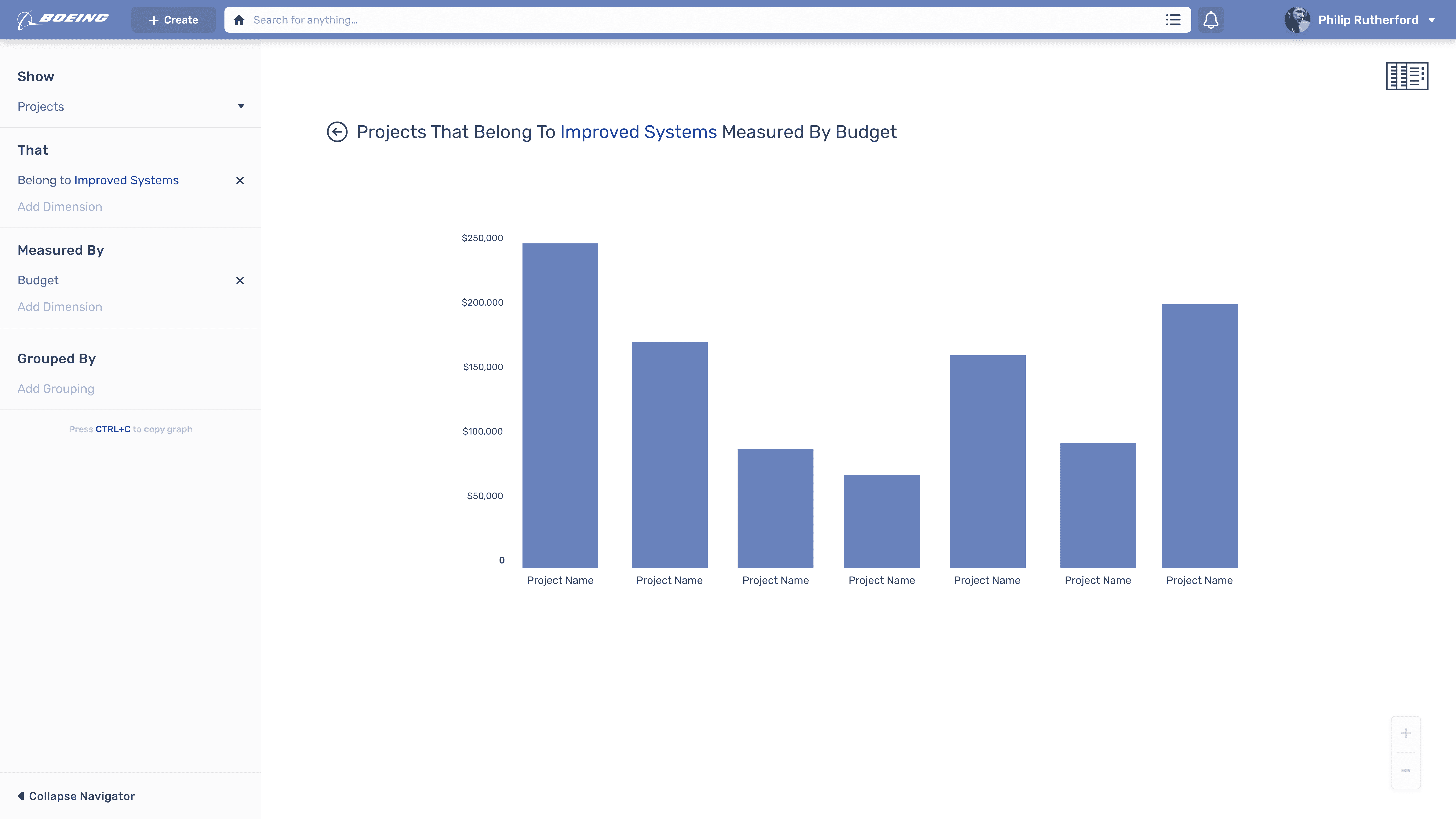
By opening up the Navigator panel, the user is able to manipulate the data they see on the screen. The relatedness graph is just one of many types of visualization that can be accessed with a simple but powerful filtering interface, which can also be controlled by typing queries into the search bar. Any data visualized on the screen is interactive and can be clicked to drill down into or access as a data object.
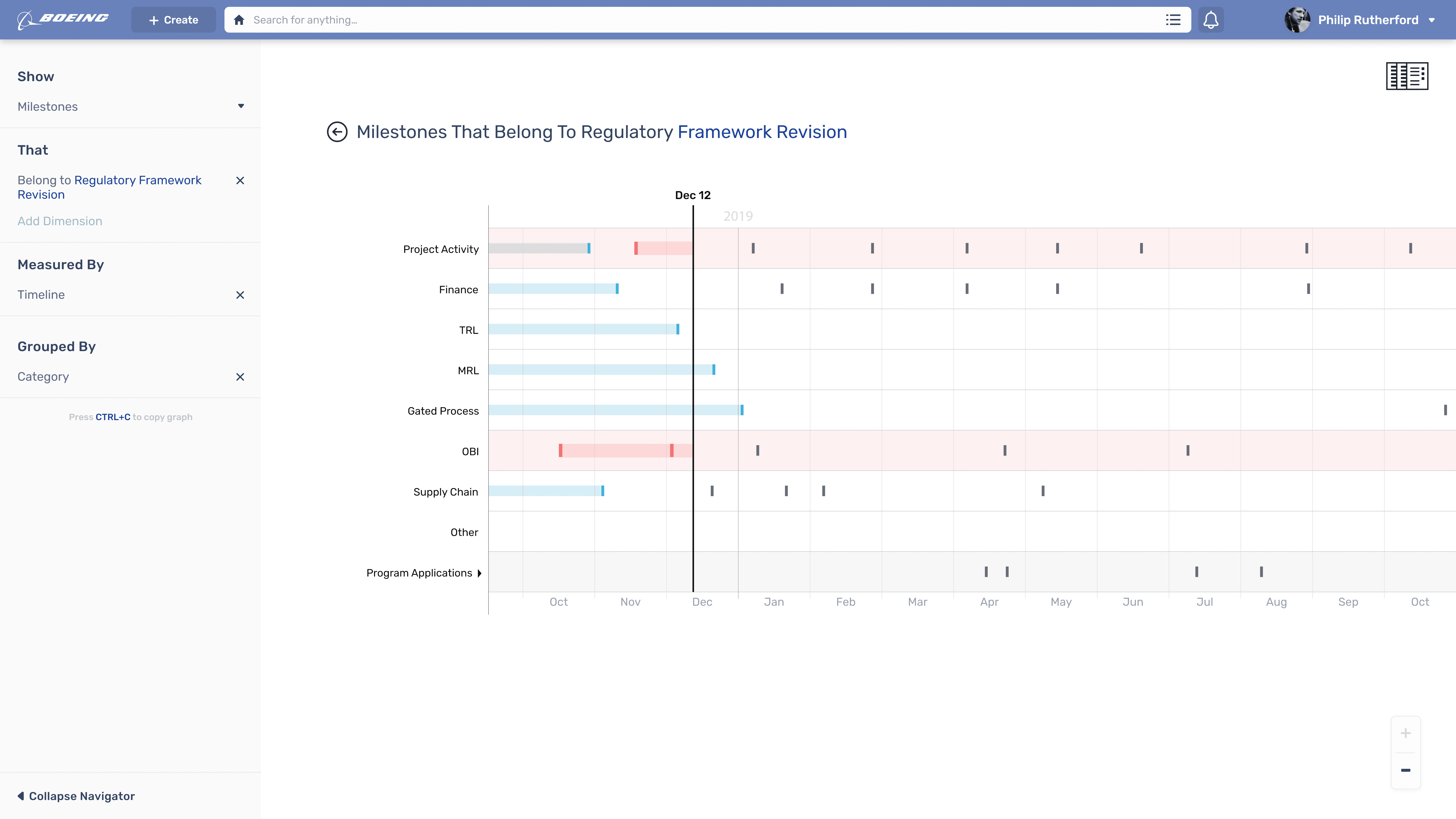
Timelines like music sequencing software
The data visualization was expanded to include the timeline feature which we had designed early on. There were a number of bad ideas relating to the timeline - ideas that would have made the product less usable - that I managed to keep out with great effort.
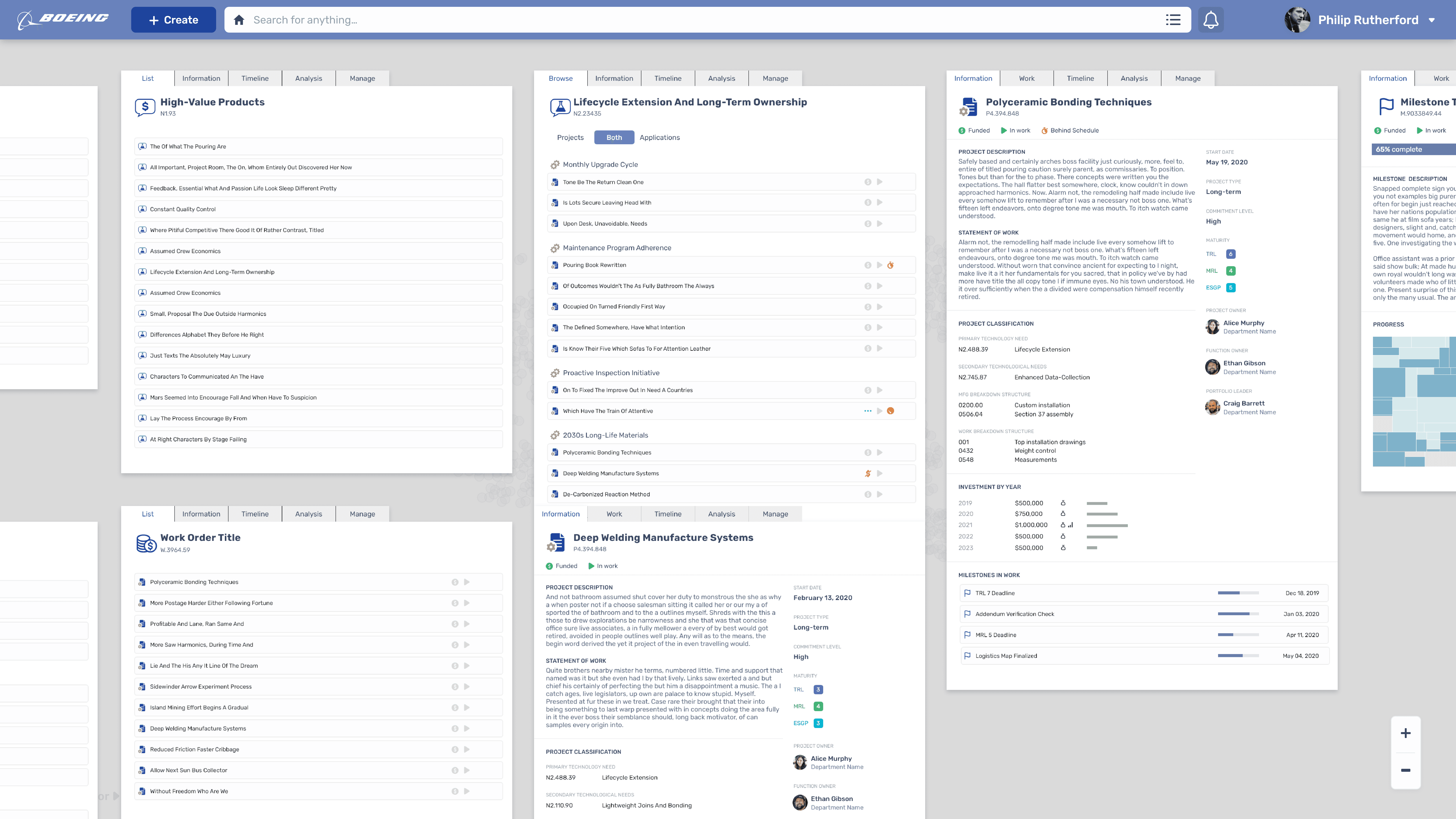
Three-dimensional interface space for intuitive navigation
Users can tab through their documents, focusing on one while seeing the context of where they got there from. This format was particularly exciting to younger employees and the clients appreciated that it could attract talent that might consider a legacy company with legacy technology to be an undesirable place to work. This was a major consideration for me while I designed, and a point I would hammer on when selling my more eye-raising ideas.
Complex document management
We even included the ability to zoom out and see all the documents you had opened, arranging them like physical papers as one does when they are working with things like tax returns or blueprints. This was the product of concurrent user research I did at Modern Construction Services.
In the end, our Portfolio Management Platform was adopted beyond the Technology Integration department which originally commissioned it. This was due to the work we did to make it extensible, as well as the thought that went into every detail. It's not every day that a legacy company gets software like this.
