Explaining complex data structures to business users
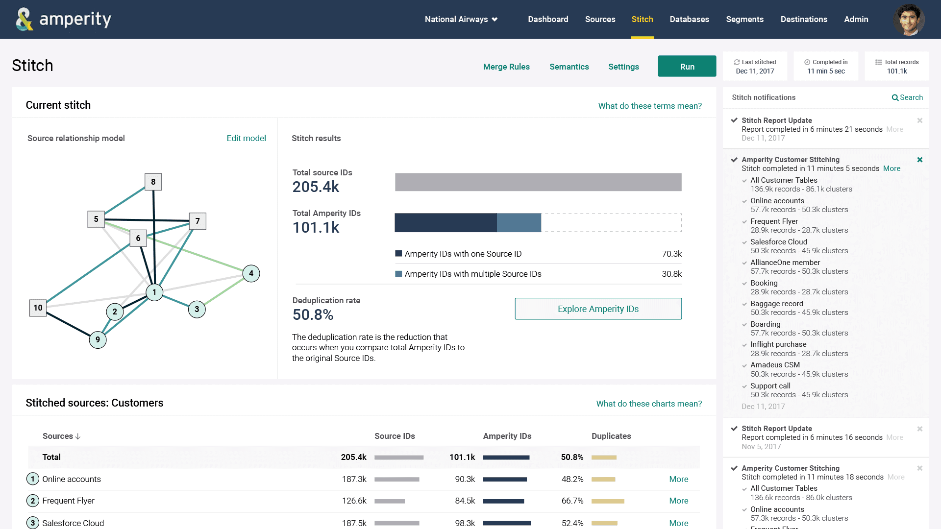
Amperity works by comparing large data sets to identify rows (customers) that appear to represent the same individual. To communicate this abstract concept to business users who aren't data scientists, I visualized each database as a node. The more concordance between databases, the darker the line that connects them. There is also a simpler graphic that shows how Amperity Stitch function has eliminated duplicates across the total data set to create a unified picture of a company's customers.
Easily compare data sets
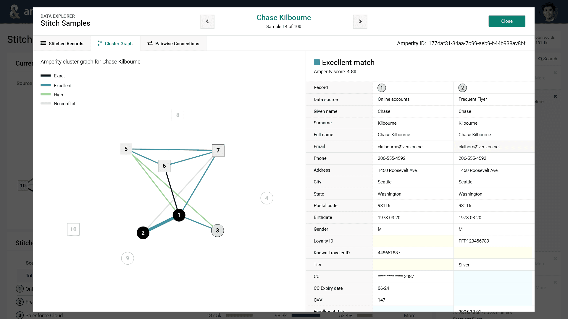
The user can also sample their total data set to understand how the system has works. The system's logic in connecting the same person across different databases is shown at the right of the screen with discrepancies highlighted. The node visualization is also used to show for each individual customer how they have been identified and where they exist in the data set.

