Historigraph

My role

Creator

Background

In an increasingly complex world, the ability to make sense of large amounts of information and how disparate entities relate to one another over time is more important than ever. At the same time, with AI (claiming to) threaten jobs, it is equally important to demonstrate the power of human intuition which is that very ability to make correct conclusions based on seemingly unrelated information. This ability is something AI lacks and will likely always lack.

Design problem

Create a data visualization that allows a person to track the interaction of many variables over time rather than prioritizing a fixed number of metrics. The purpose of this is to create an environment in which intuition can thrive. This problem has been solved for fixed moments in time with tSNE (see Boeing) but the work with Seattle Sport Sciences required the analysis of complex interactions over time.

Solution

The historigraph compresses many (effectively unlimited) variables into a single (Y) axis, much in the way that tSNE compresses them into two axes. The remaining (X) axis is used to depict time. The choice of which variables to use for the Y axis is optimized to rely on points of reference known to the user, enabling external cognition (the graphic) to synergize with internal cognition (the user) and produce insights.

Outcome

The historigraph was successfully implemented with Seattle Sport Sciences, resulting in a product that has sold to several European soccer franchises. The examples below are "consumer" versions that depict history in order to demonstrate the principles.

American history in a single glance

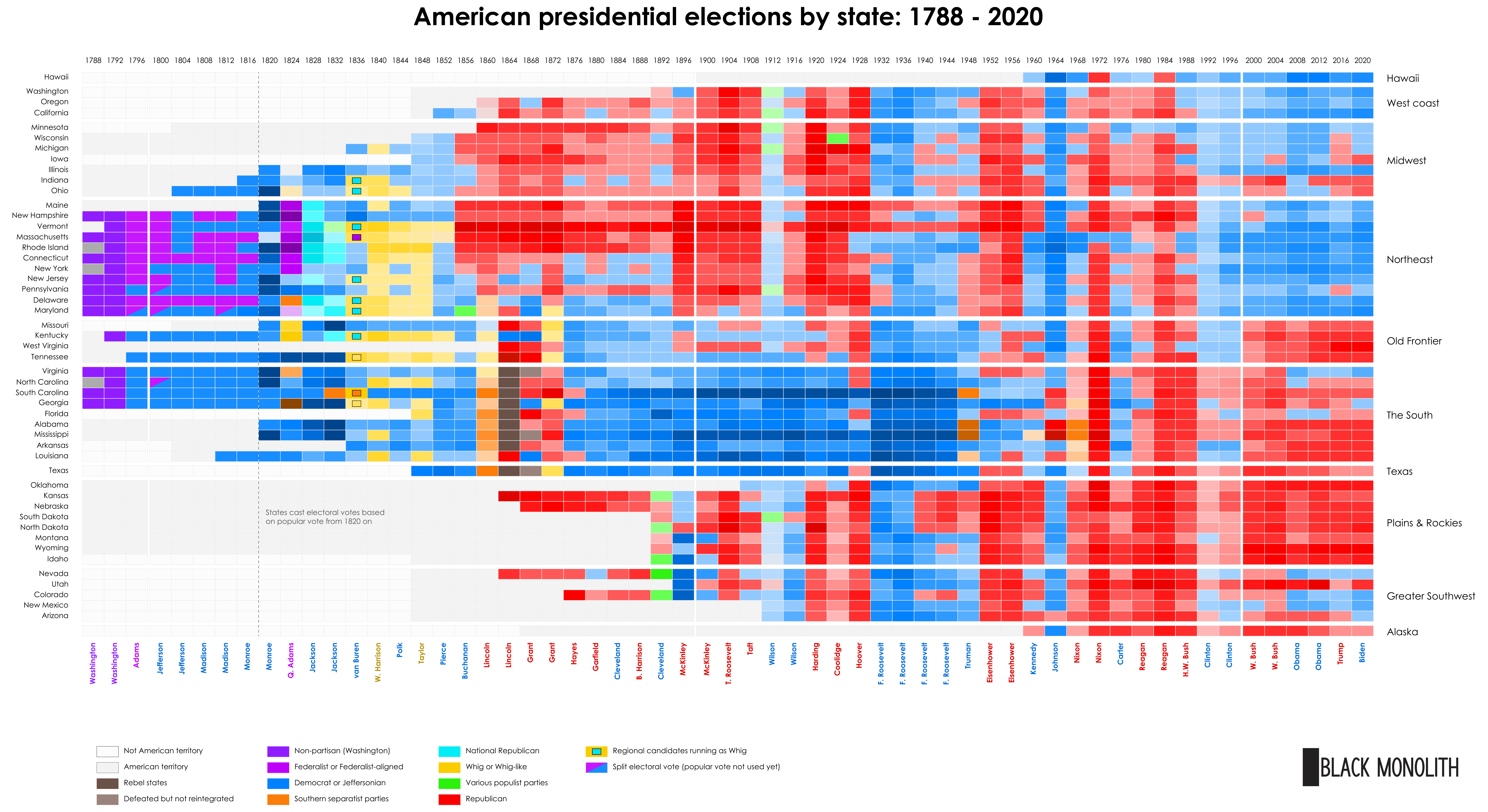
This visual depicts every presidential election from 1788 to 2020, with the hue representing the winning party and the intensity representing the margin of victory. The distinct eras of American politics (known as the "party systems") are clearly visible. This graphic demonstrates the effectiveness of the historigraph as a means for teaching complex history which would otherwise be overwhelming for learners.

This is what difference spatial formatting makes

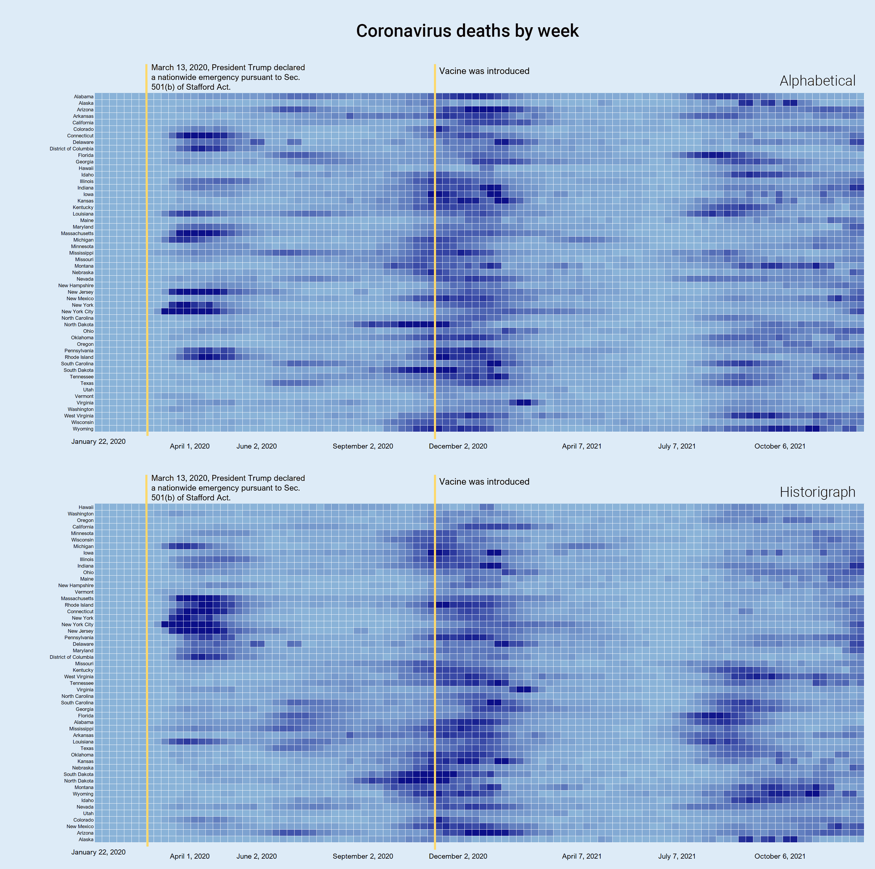
The data above is coronavirus deaths from the start of the pandemic to early 2022. When the data is alphabetically sorted, the picture is muddled. General waves are discernible, but the spatial nature of the pandemic is completely lost. When it is converted to historigraph format, you can clearly see where outbreaks of COVID start and how they spread.

Even simple data sets can tell a big story

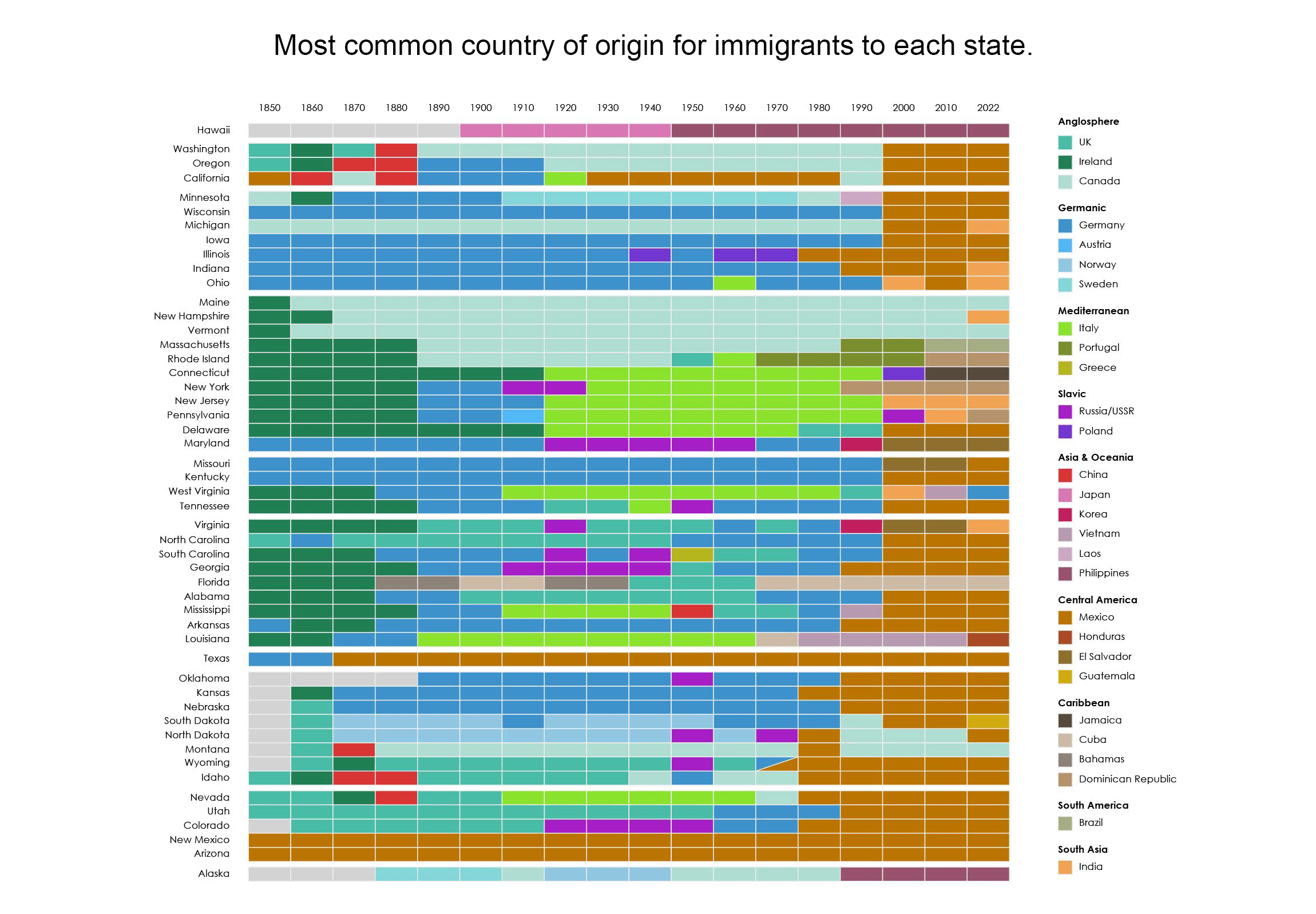
The above graphic shows immigration data for the United States. It demonstrates Edward Tufte's "micro and macro readings" as you can view the immigration pattern for each state, or the predominant trend across the nation, or focus on specific nationalities. Even with the data only available in 10-year intervals, the picture is still clear and compelling.