Physical, spatial interface
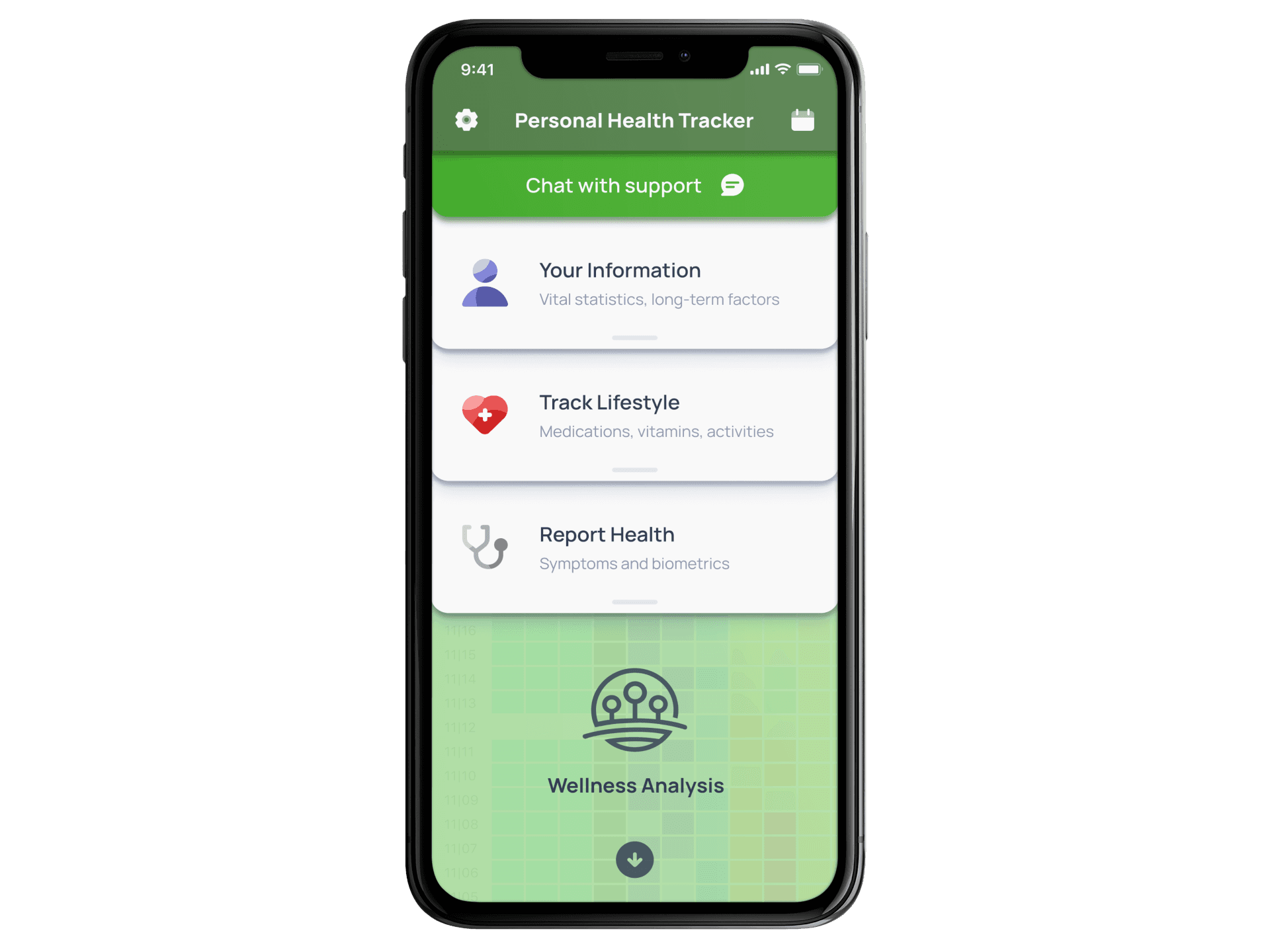
The target user group of the Personal Health Tracker was by nature dealing with cognitive issues ranging from ADHD to schizophrenia. Any of these are an impediment to both motivation and the ability to understand complex software. Our research found that the flat design fad is absolutely ruinous to usability. Flat design is cognitively taxing on users, and our users were already compromised. So I devised an interface with purely functional 3D design. The shadows and bevels are not there for decoration but to mimic a physical interface.
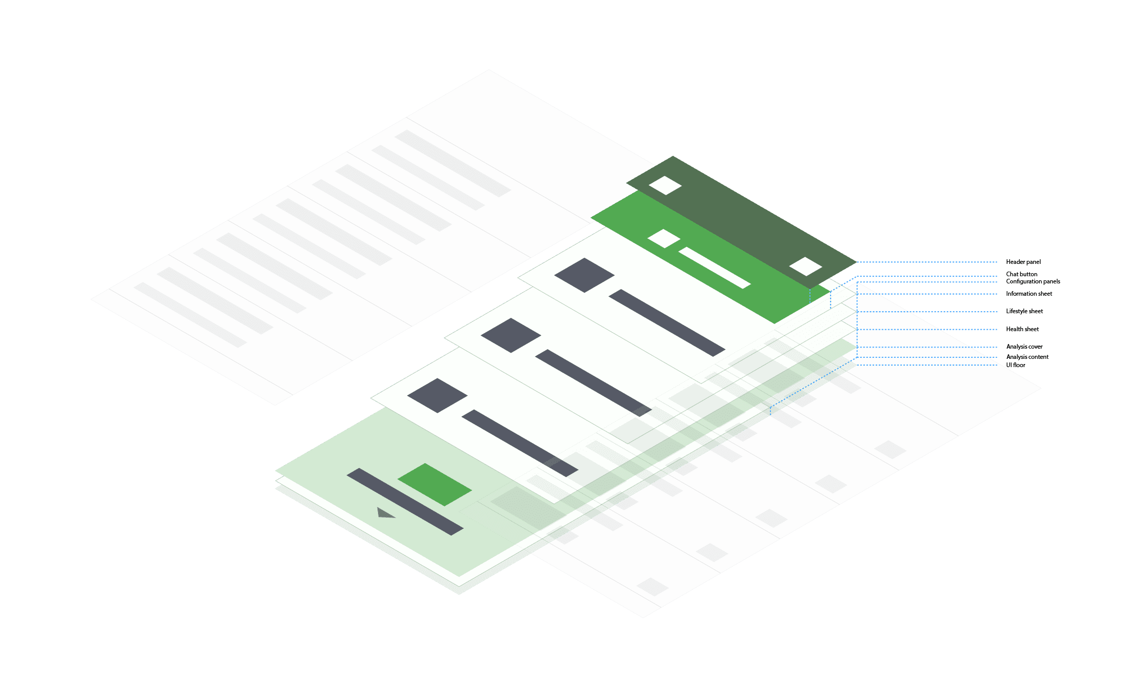
3D modeling of the interface
Not only was the interface designed to look like a physical space with recognizable textures and forms, but it used consistent spatial relationships. Arbitrary behaviors are hard for anyone to process, but especially those with cognitive disorders. I used isometric modeling of the interface to illustrate how all the interface layers would relate to one another, and it was essential in creating specs for developers who were not used to this UI paradigm.
Chat-focused interface
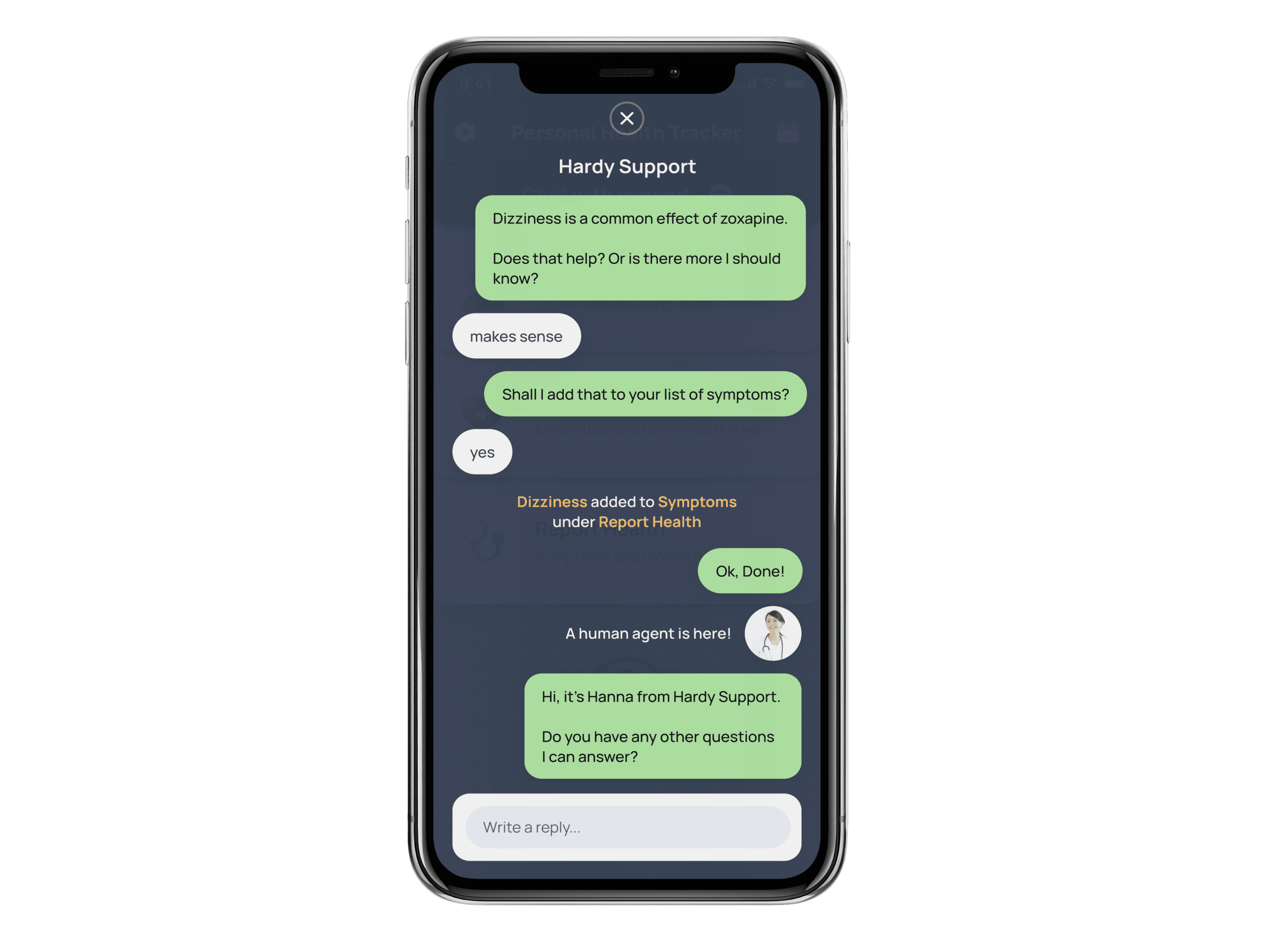
Ultimately, most of the interactions with the app focused on chat. User testing showed that people inevitably wanted to do specific things that the app couldn't do yet, and they ended up contacting the company by phone. The company uses round-the-clock human support staff to answer customers' questions about the products and their medical conditions. In order to reduce reliance on phone support, the app enabled users to input commands via a chat interface using a "man behind the curtain" approach.
No teleporting
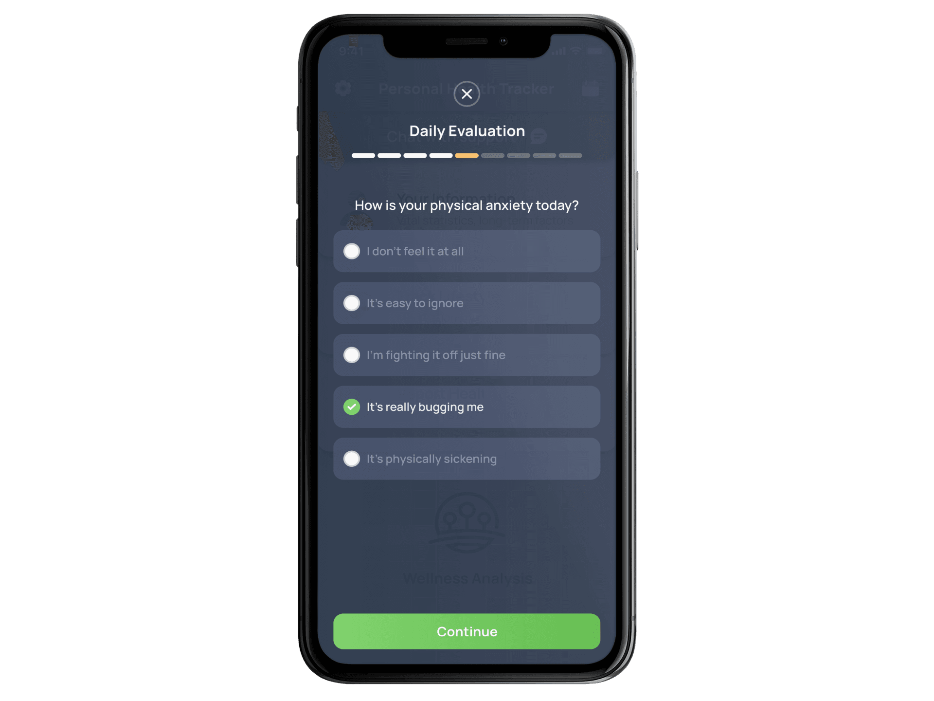
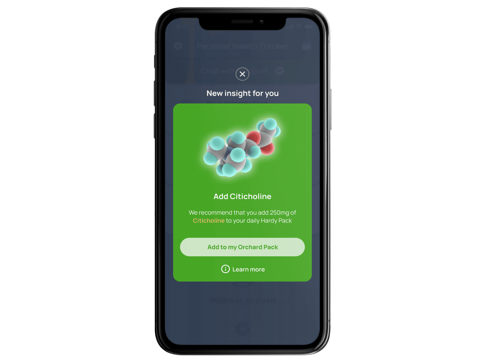
Another common UI design practice that harms usability is "teleporting" in which the screen jumps from one location to another with no spatial relationship between the two. Again, this is a form of abstraction that is alien to human experience and thus cognitively expensive. So instead of blinking from one screen to another, overlay screens such as daily evaluations appear over the main interface, with a subtle transparency, reassuring the user where they came from and where they can return to easily.
Gamefied experience with intrinsic rewards
To encourage users to continue filling out information, adjustments to their personalized nutrient package are presented as "insights" and visually depicted as cards that the user can collect. This creates a two-layered motivation for the user: they receive a real-life benefit from a better nutrient stack and it is digitally visually represented as a sort of "trading card". Self-discovery is reified into a tangible thing.
