Historigraph
An advanced new form of visual to help you understand complexity.
What is it?
A historigraph demystifies complex events in a way that conventional data visualizations or text cannot do, allowing you to rapidly understand situations that you might otherwise find overwhelming. This has important applications in business analysis and also history education.
Historigraph Examples




How it works
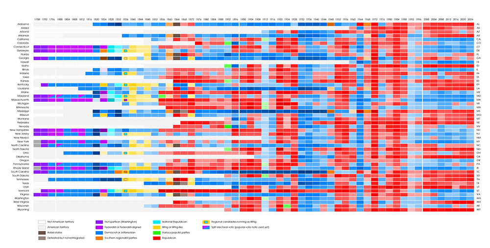
This is a heatmap of presidential election results. Each row is a state, each column is an election year. The states are arranged in alphabetical order, which is arbitrary non-information. It is chaotic and very difficult to derive any useful information from.
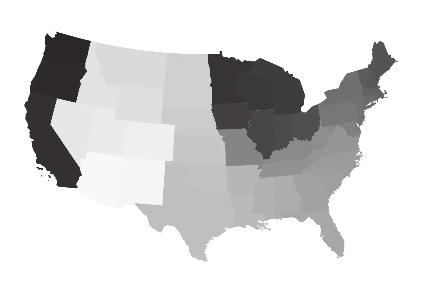
The map below is a linearization plan for American states. What that means is that, if each state is laid out in a line, the light/dark value of the state represents whether the state would appear toward one end or the other end of the line.
In the example below, Washington appears on one end of the line and Arizona appears at the other. The shades of grey represent all the states in between. Oregon and Idaho are the closest states to Washington, but Oregon is culturally more similar, so Oregon appears next to Washington on the line. This continues on for the rest of the states.
As you can see there are sudden jumps in color, between the coastal states and the inland west states, and between the inland west and the upper midwest. This is due to the information loss of projecting a 2D map onto a 1D line, particularly with a rectangular landmass. In order to minimize the information loss, the states are ordered in such a way that the inevitable jumps occur across cultural and political fault lines.
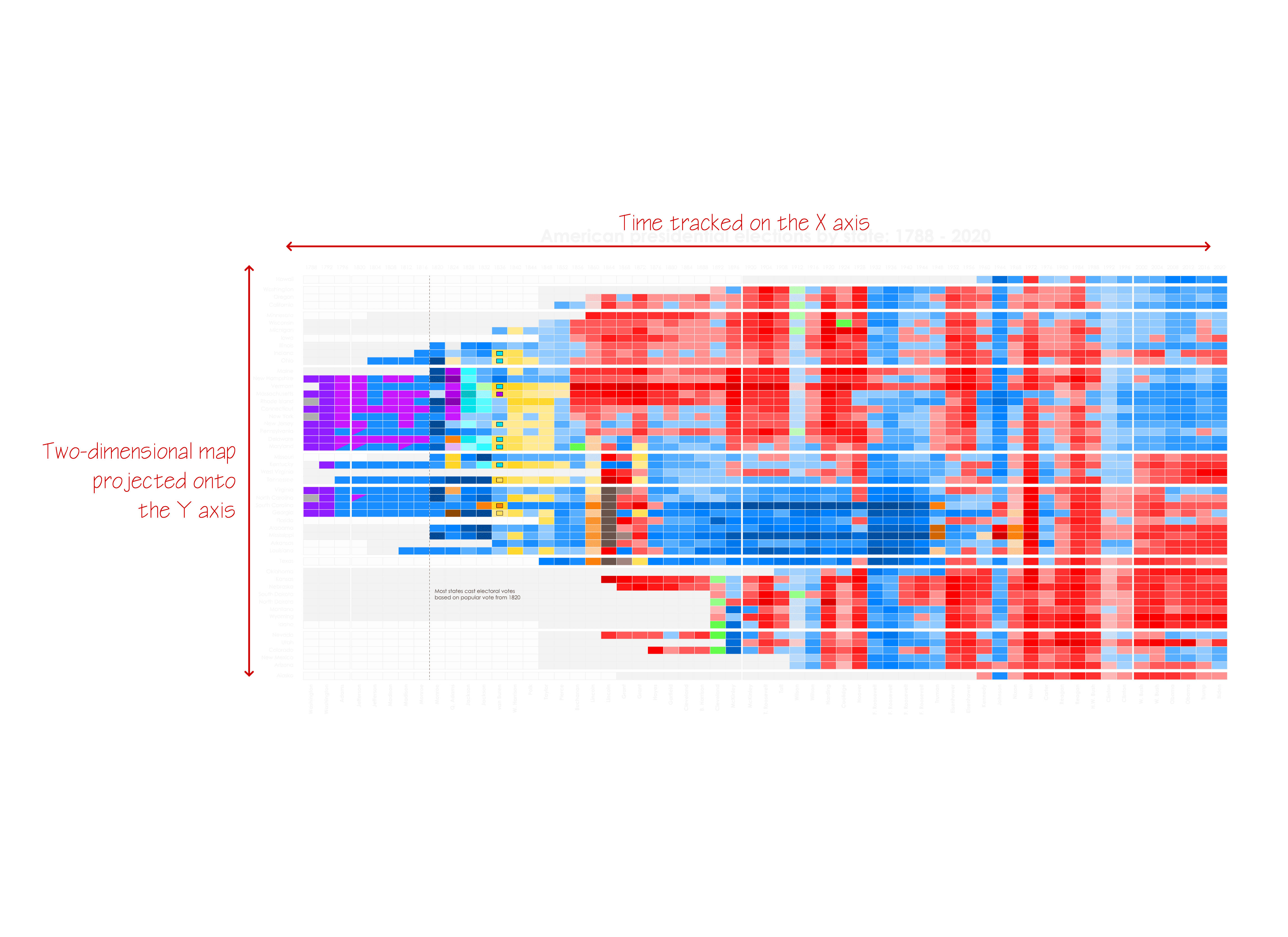
That geographically determined line of states is shown below. Rather than a meaningless order like alphabetic, a we have a geographically significant order. By condensing a 2D map into a 1D Y axis, we have freed up the XX axis to represent time. In short, we can now represent three dimensions on a 2D image.
The result speaks for itself. Domestic geopolitical patterns emerge instantly. Meaning is instantly conferred on the chart.

Background
While working for Seattle Sport Sciences on AI-powered video analysis software, I had to create tools for understanding the "thinking" of the AI because our program had users who were both smart and very physically-minded. They weren't going to take on faith what a computer program told them. This meant they had to work in a partnership with the AI. The historigraph is just one of the many visualization tools I came up with.
Business applications
The historigraph was successfully implemented with Seattle Sport Sciences, resulting in a product that has sold to several European soccer franchises. The examples below are "consumer" versions that depict history in order to demonstrate the principles.
News media can use the historigraph to keep viewers informed of the big picture rather than relying on anecdotal stories.
Site traffic and content can be tracked over time to identify patterns and events.